Are you sure you want to perform this action?
18. November 2020 • The Misprint Collection
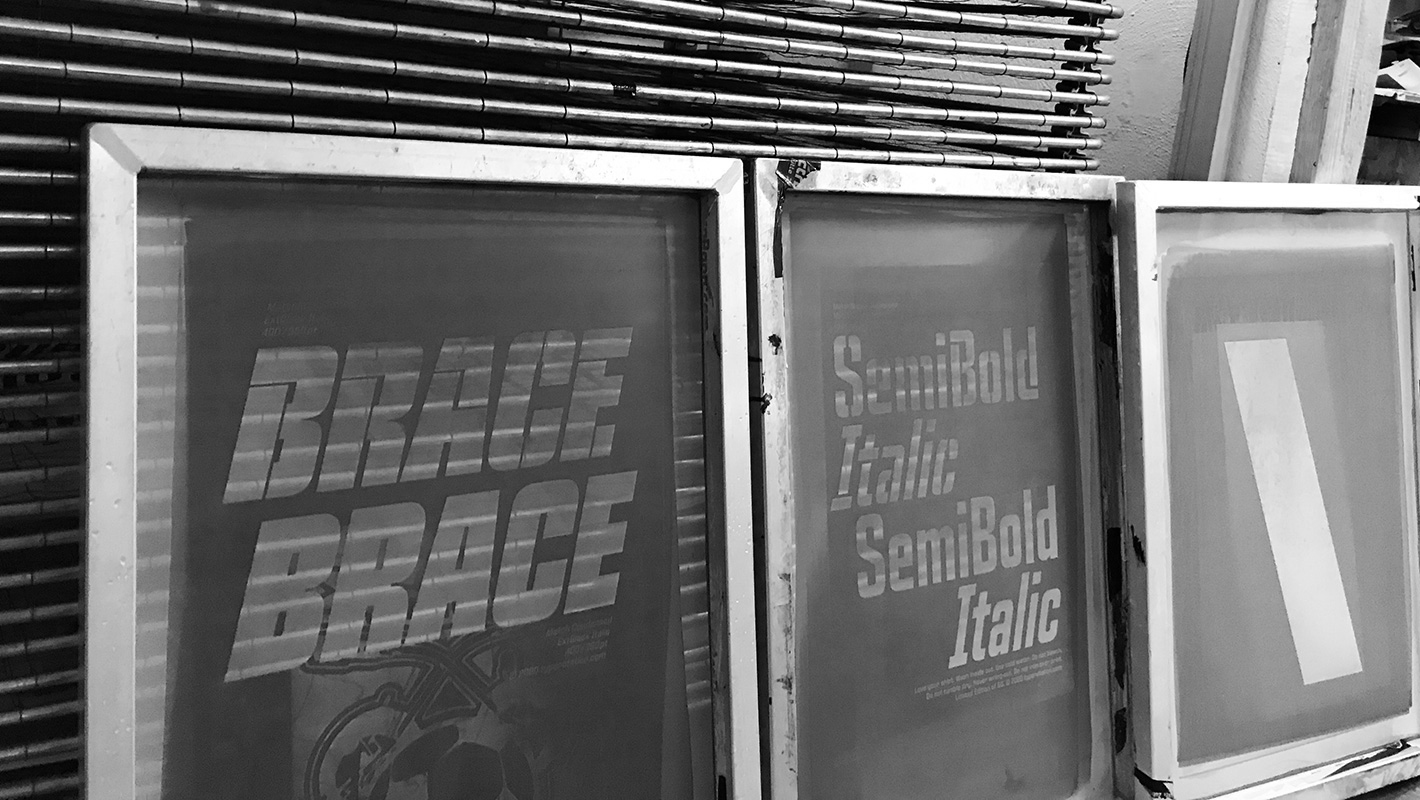
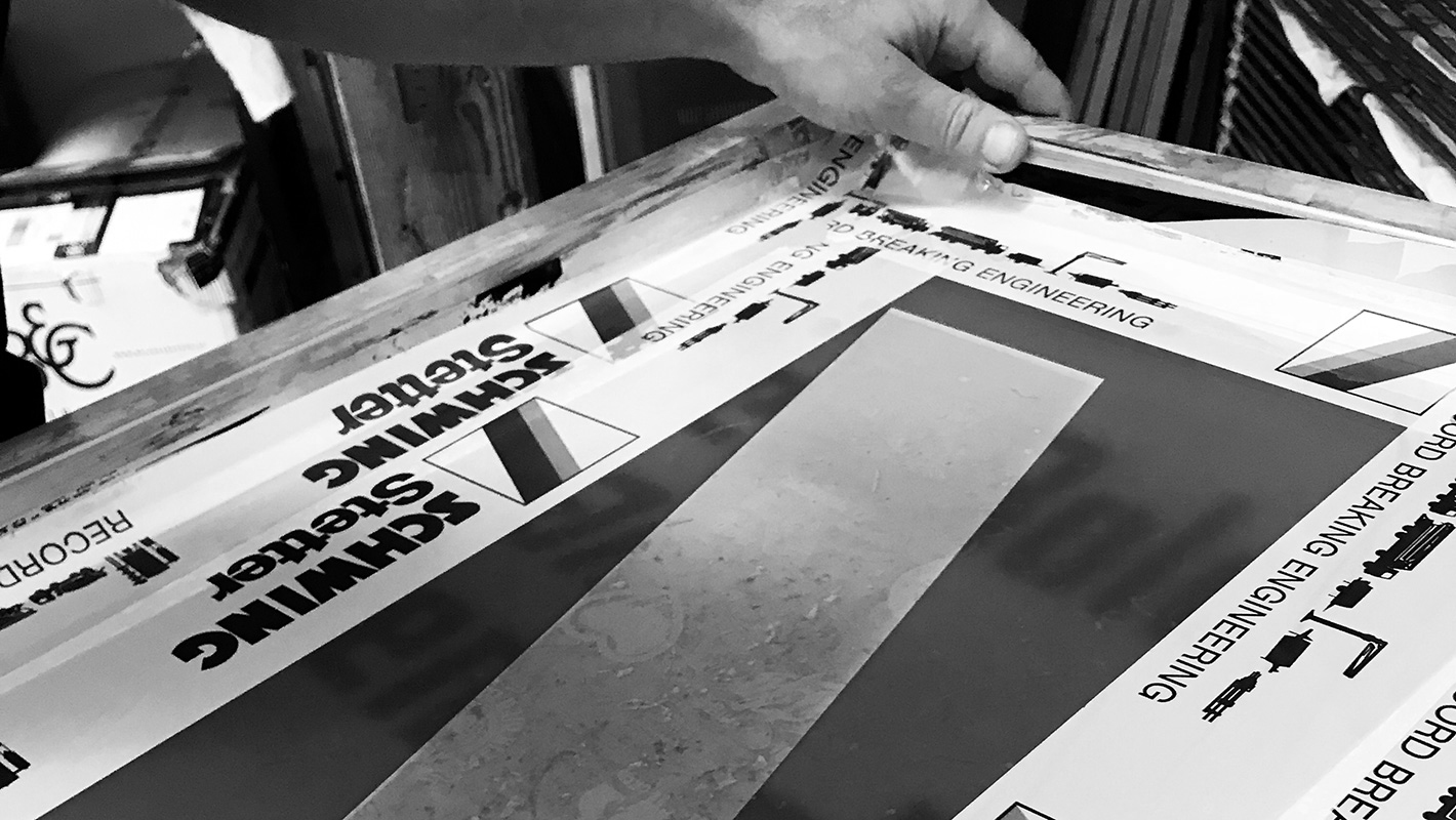
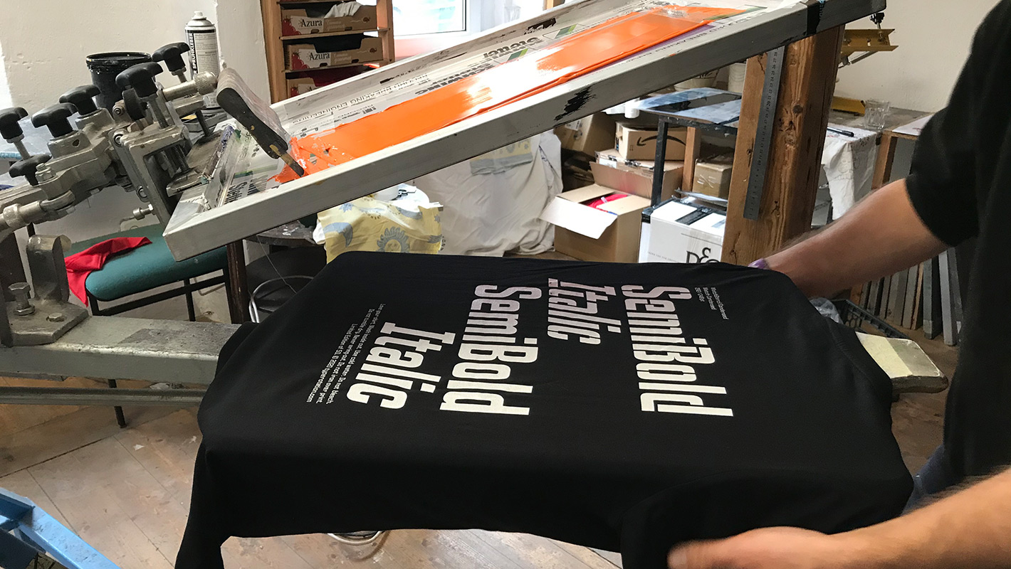
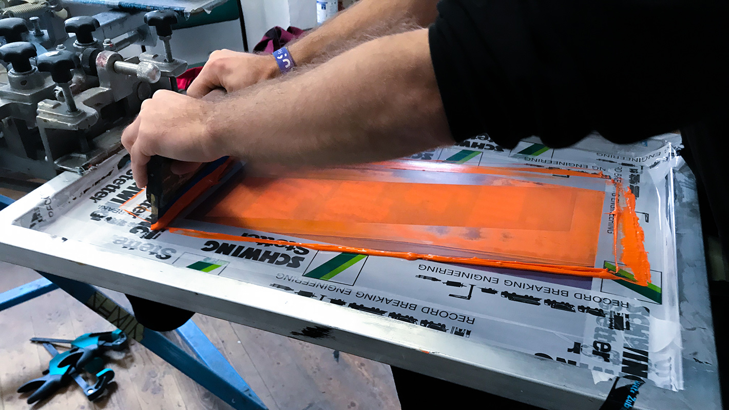
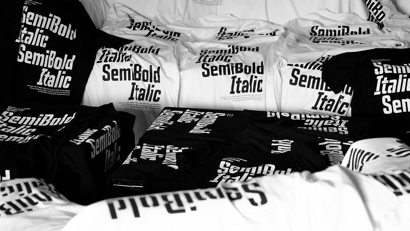
One of Typerotation's main goals is to transfer our digital fonts to an analogue translation — each release of a digital font family is not complete until a physical specimen is produced. In this way, we want the digital, disembodied fonts to be experienced with more than just your eyes. Just as in the days of lead type you could touch type, feel its weight, sense its temperature, absorb its smell, we are creating a translation of these sensory perceptions. With the release of the Match and Match Stencil Superfamily we started with an initial limited T-shirt collection, two motifs each in black and white. In order to fully experience the process of the production, to get an influence on it at every step and also to make ourselves aware of the value of our product, we decided to finish the T-shirts by hand with screen printing. Read more about the Match Shirt Collection here. Many aspects come together in the hand screen printing process and so, despite experienced craftsmen, an eye for perfection and good planning, it is impossible to avoid unforeseen results. We leave the path of Command+Z. As soon as the color contacts the shirt, it is connected to it inseparably. In addition to a well-set-up screen, the selection of the appropriate color as well as the positioning of each individual T-shirt, the application of sufficient pressure when the squeegee is pulled over the screen, for example, the consistency of the ink as well as the influence of the ambient temperature on it play a decisive role.
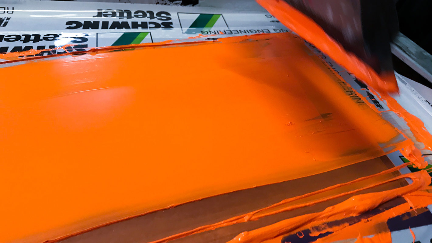
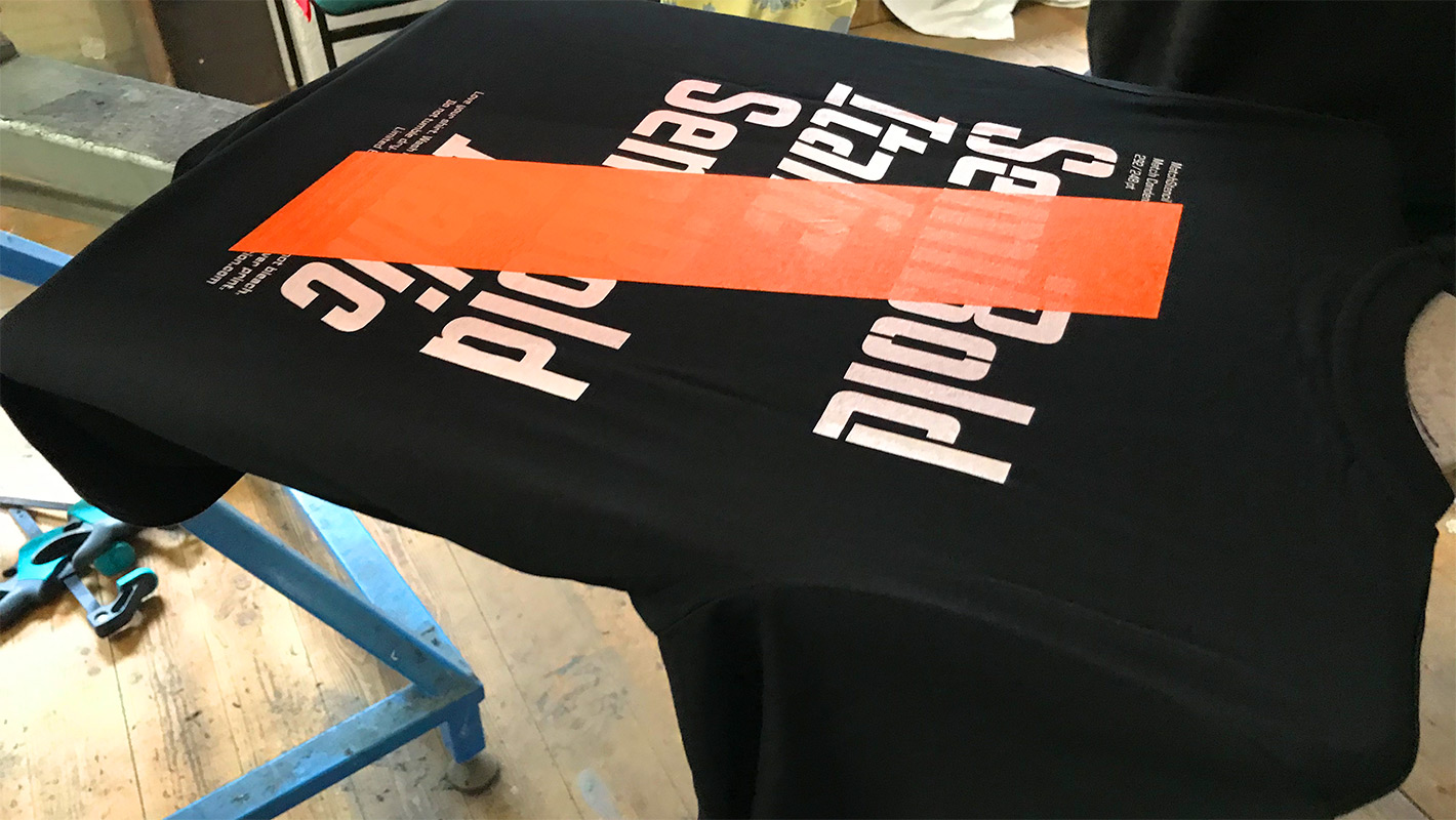
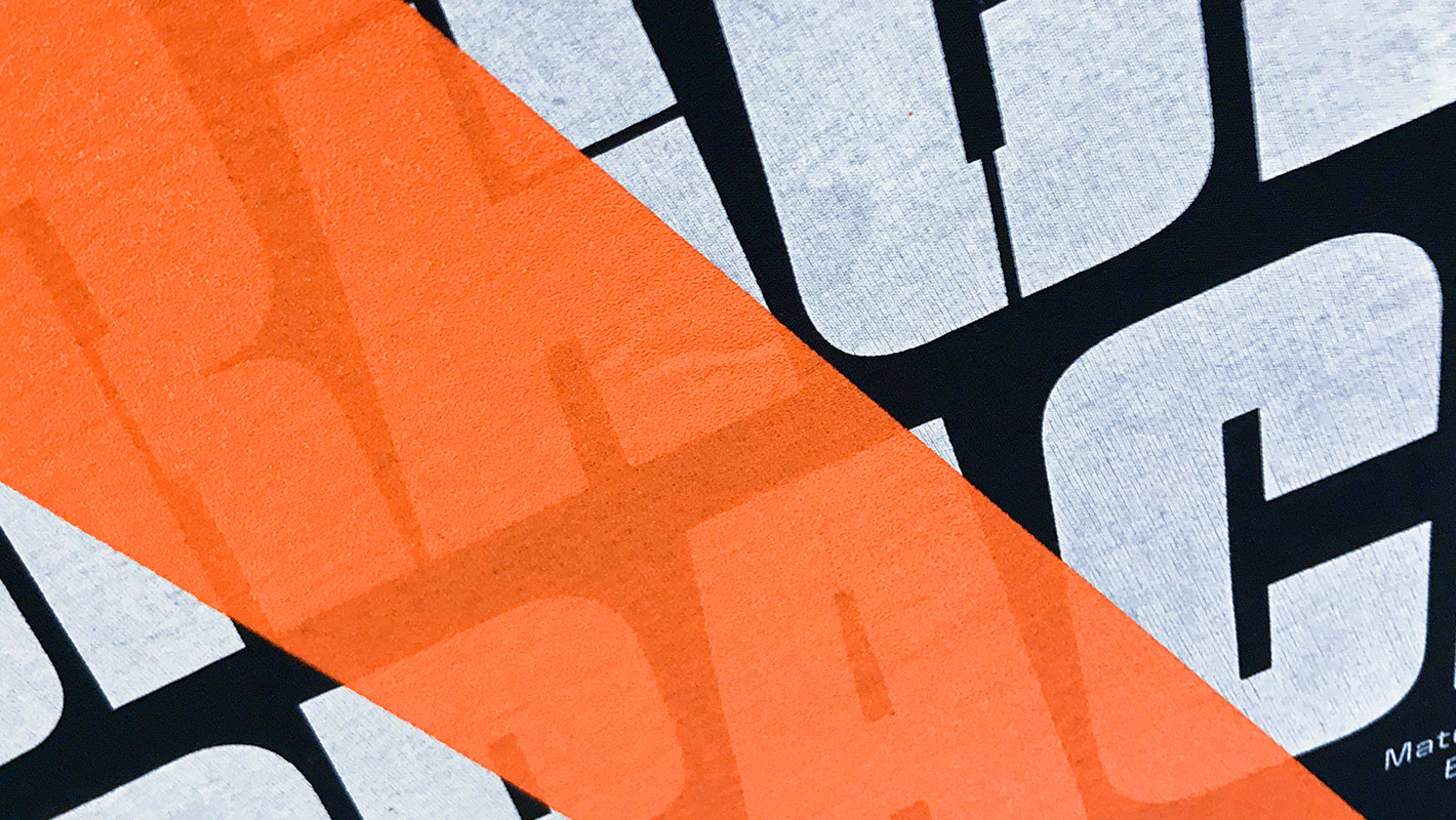
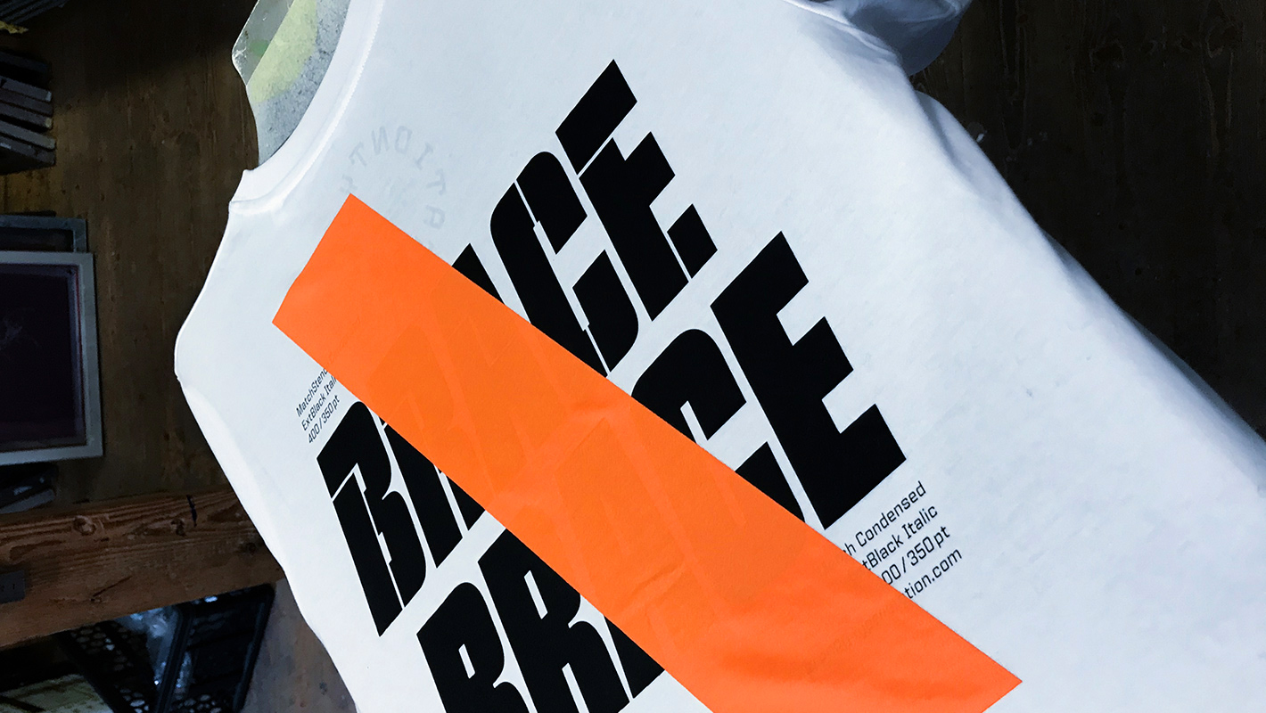
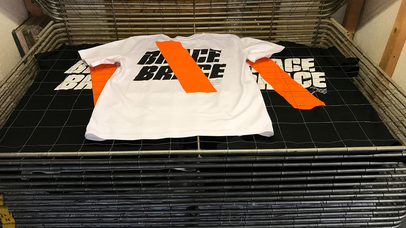
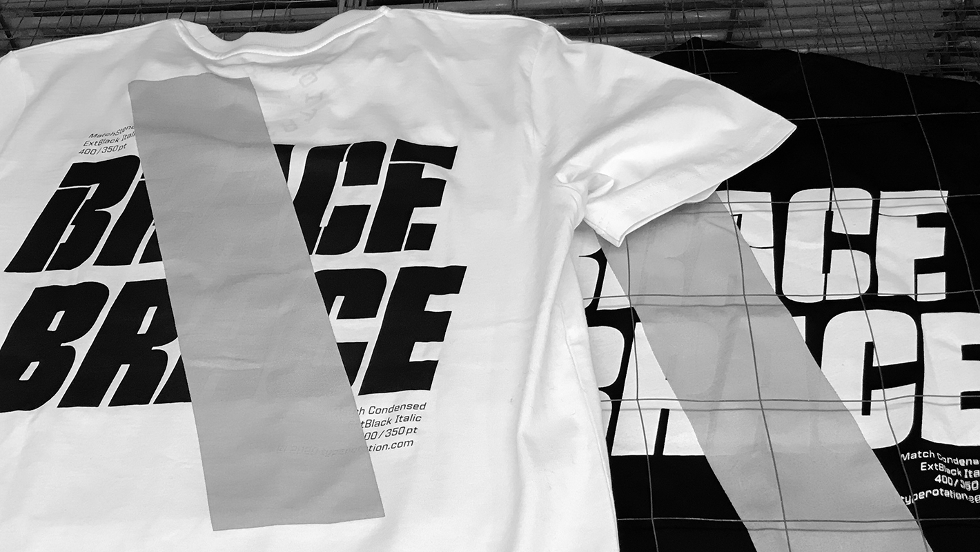
The Match and Match Stencil Specimen shirts do have three prints (inner label, front logo, back print), which means each shirt goes through three printing processes, each of which is also a new potential source of error that can »ruin« the entire shirt. And so we ended up with several T-shirts that didn't look the way we had envisioned in advance. What next? In total, we had 17 shirts that no longer corresponded to the digital template. Since we have the aspect of sustainability deeply anchored in our philosophy and it was not an option for us to dispose of the faulty shirts, we decided to consciously take up the resulting error aesthetic and think further. And so we developed our first Misprint Collection from it — each of our T-shirts is an original in its own way, but the shirts in the Misprint Collection are truly unique. We break the actual design and bring color into it. The backslash in signal orange, crosses out the original back motif and emphasizes it at the same time and thus its imperfection. True to the motto: be unique. Live the imperfection.
Click here for the Misprint Collection